By: Vanita Ganesh
September 25 2024
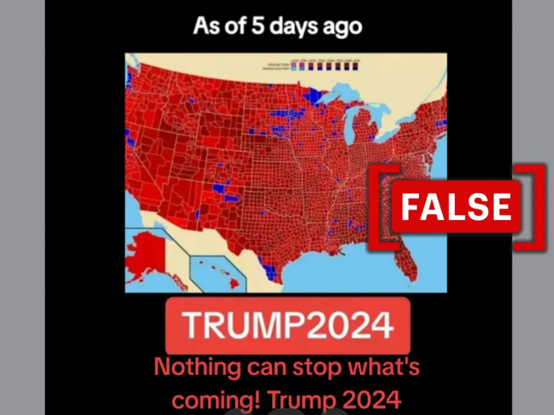
 The viral post on TikTok claims to show a recent electoral map shows overwhelming support for Trump across the U.S. However, it is old and unrelated. (Source: TikTok/Modified by Logically Facts)
The viral map has been online since 2009 and has been shared many times since then. It is unrelated to the 2024 U.S. elections.
What is the claim?
An image depicting a U.S. map colored predominantly red, representing the Republican Party, with some blue swatches for the Democratic Party, has been shared online. It is claimed to represent Republican presidential candidate Donald Trump’s predicted win in the upcoming general elections.
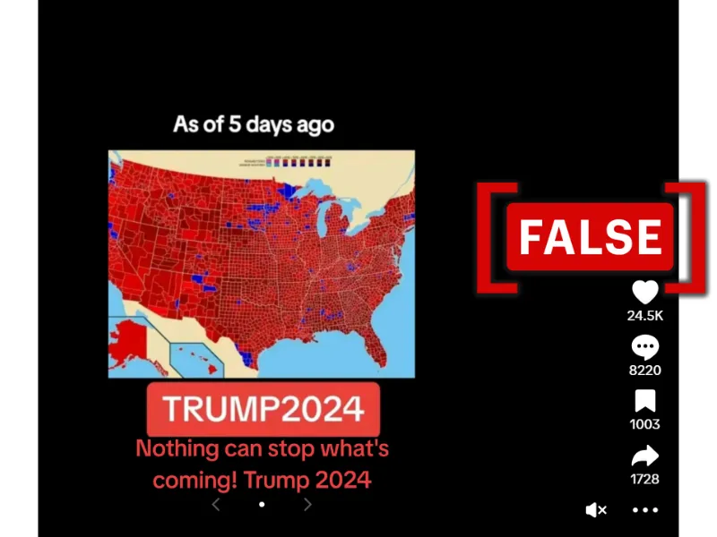
The map, which was posted on TikTok with the following text overlaid, “As of 5 days ago” and “TRUMP 2024 Nothing can stop what's coming! Trump 2024 (SIC),” claims it shows Trump and the Republican Party’s dominance across the U.S. It garnered over 24,000 likes, 8220 comments, and was shared 1,728 times on TikTok. Posts with the same map can be viewed on YouTube, X (formerly Twitter), and Instagram.

A screenshot of the viral map claiming to show overwhelming support for Donald Trump ahead of the 2024 U.S. presidential elections. (Source: TikTok/Modified by Logically Facts)
However, we found the map, which has been online since 2009, to be unrelated to the presidential election in November 2024.
What we found
After conducting a reverse image search, we could not find any recent credible reports containing the map.
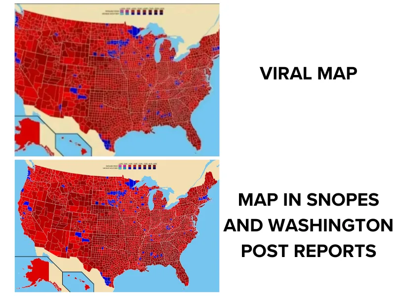
However, we found the map used in a post published on October 2, 2019, by the media platform Snopes (archived here). The post uses the map in a report on a similar map used by then-U.S. President Trump amidst an impeachment investigation. The report describes the map in question as a county-by-county election result map from 1972 to show Richard Nixon’s victory. The same map is also featured in a 2019 Washington Post article (archived here) about Trump’s impeachment investigation.
The Snopes and Washington Post articles report on Trump’s "Impeach This" map, which was actually a 2016 electoral map that he shared after U.S. House Speaker Nancy Pelosi announced a formal presidential impeachment investigation in 2019.

A comparison of the viral map with the map used in the Snopes and Washington Post reports. (Source: TikTok/Snopes/Washington Post).
We also found the same map uploaded to a Wikimedia Commons page (archived here) dating to August 3, 2009. The description states that the map was created by user "Tilden76," with inspiration from http://uselectionatlas.org. It is described as a “Map showing the results by county of the 1972 United States presidential election specifically identifying the percentage received by the winning candidate in each county.”
This confirms that the map is not recent, as claimed in the viral TikTok post, but has been online since at least 2009 and is unrelated to the ongoing U.S. general election campaign.
We also found the same map uploaded multiple times to a Reddit community dedicated to sharing maps in 2012, 2015, 2021, and 2022 (archived here, here, here, and here), confirming that the map is not recent or related to the ongoing U.S. presidential election campaign. All the Reddit posts describe the map as depicting the 1972 presidential election results.
The verdict
Our research found that the map has been online since 2009 and is not a recent electoral map showing Donald Trump’s popularity in 2024.
Follow Logically Facts' coverage and fact-checking of the U.S. Election 2024 here.